Blog
January 4, 2023
How Mobile Screen Size, Resolution, and PPI Screen Affect Test Coverage

Mobile Application Testing
Today’s mobile devices come in all shapes, sizes, and resolutions, and that diversity is only increasing. For developers and testers, understanding how screen size, resolution, and pixel density (PPI) impact user experience isn’t optional, it’s essential. Whether you're building a native app, a hybrid experience, or a responsive web application, these variables can significantly affect performance, visuals, and usability.
In this blog, we will explore why screen characteristics matter, how to account for them during functional testing, and how tools like Perfecto ensure your app performs flawlessly on any device.
See for yourself how Perfecto can help you test screen size, resolution, and PPI.
Table of Contents
- A Guide to Mobile Screen Size and Density
- How to Calculate PPI Screen
- Why Do Mobile Screen Size & PPI Matter?
- How to Test Mobile Screen Size With Perfecto
- The Role of AI in Optimizing Mobile Screen Experience
A Guide to Mobile Screen Size and Density
There are a variety of mobile screen sizes available. As of November 2015, tablet and mobile screen sizes range from 4.7" to 9.7".
Common mobile screen resolutions include: 480×800, 640×1136, 720×1280, 750×1334, 1080×1920, and 1440×2560. The most common resolution is 720x1280.
How Android Categorizes Mobile Screen Density
Android categorizes mobile screen density into one of six families:
- LDPI (low): ~120dpi
- MDPI (medium): ~160dpi
- HDPI (high): ~240dpi
- XHDPI (extra high): ~320 dpi
- XXHDPI (extra extra high): ~480 dpi
- XXXHDPI (extra extra extra high): ~640 dpi
| Device Name | Mobile Screen Sizes | Screen Resolution | PPI |
|---|---|---|---|
| iPhone 6 | 4.7” | 750 x 1334 | 326 (XHDPI) |
| Samsung Galaxy Note 5 | 5.7" | 1440 x 2560 | 515 (XXXHDPI) |
| iPhone 6 Plus | 5.5" | 1080 x 1920 | 401 (XHDPI) |
| iPad Air 2 | 9.7" | 1536 x 2048 | 264 (HDPI) |
| Samsung Galaxy S6 | 5.1" | 1440 x 2560 | 515 (XXXHDPI) |
| iPhone 6S | 4.7" | 750 x 1334 | 326 (XHDPI) |
| Blackberry Passport | 4.5" | 1440 x 1440 | 452 (XXHDPI) |
| iPhone 6S Plus | 5.5" | 1080 x 1920 | 401 (XHDPI) |
| Google Motorola Nexus 6 | 6.0" | 1440 x 2560 | 515 (XXXHDPI) |
| HTC One M9 | 5.0" | 1080 x 1920 | 440 (XXHDPI) |
Source: (Perfecto's Device Coverage Index, Nov. 2015)
It's important that you don't mix devices and operating systems based on the location of the devices. And it's also important to understand that screen size and resolution can change visuals.
For example, two Samsung devices with the same screen size but different resolutions might show different visuals to the user. Or they will consume more CPU and battery to process the various app visuals on these devices.
As a starting point, it is easy to determine your device's PPI and classify it as one of the density families accordingly.
Back to top
How to Calculate PPI Screen
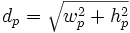
1. Calculate the Dp Value
Here's the formula to calculate the Dp value:
(calculate the device screen resolution square root --> for iPhone 6 it would be 750 x 1334)
So, you'll get 1,530 as the Dp value.
2. Match the Screen Size to the Dp Value
Match the screen size to the above Dp value to get the PPI.
An iPhone 6 device, which has a 4.7'' screen size, will result in 326 PPI.
Back to topWhy Do Mobile Screen Size & PPI Matter?
Mobile apps run on different devices equipped with very different hardware (systems on chip). Therefore, these devices have a varied amount of CPU as well as battery types. This impacts performance.
So, loading a given app on an LG G4 (5.5'') with 515 PPI would be different from an iPhone 6S Plus (also 5.5") but with a 401 PPI. The CPU, battery usage, and performance (responsive time) would be different for each device.
Because there is such a large, fragmented market of devices, there's a lot for developers and testers to consider. You ought to be thinking of the end user experience. And that means app performance, visuals, usability, and robustness.
It will be critical to know your app's benchmark performance on a variety of devices. This is a good step toward having the right test coverage for your mobile app.
Back to topHow to Test Mobile Screen Size With Perfecto
Testing screen size, resolution, and PPI among manufacturers should be your first step in assuring good user experience across platforms.
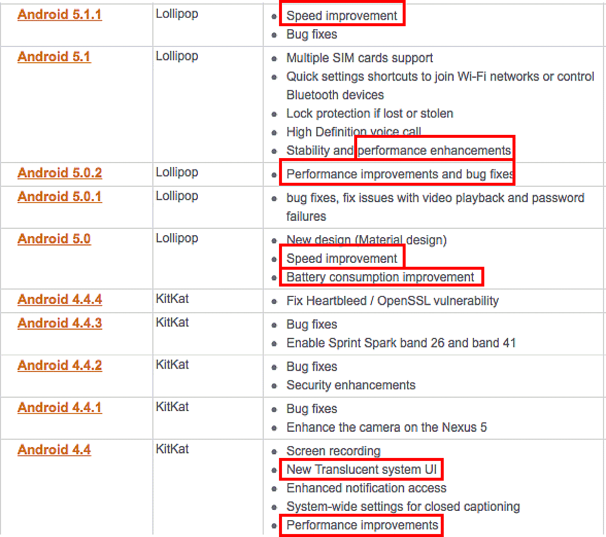
Take a look at the Android OS release history below. It's clear that bug fixes around performance, battery consumption, and user interface are key.
Another aspect of mobile screen sizes teams should incorporate in their testing is the advent of foldable phones. Teams will need to ensure their apps can correctly adjust and function with all sorts of devices with foldable screens. In 2022 alone, more than 14.2 million foldable smart phones were sold.
Back to topThe Role of AI in Optimizing Mobile Screen Experience
Artificial Intelligence is transforming mobile app design and testing. AI’s ability to analyze massive datasets in real time allows for enhanced optimization of how applications interact with varying screen sizes and resolutions. Here are three key ways AI makes an impact:
Adaptive Display Optimization
Applications designed for mobile devices require adaptability to accommodate numerous screen configurations, from compact smartphones to expansive tablets. AI uses machine learning algorithms to:
- Detect screen sizes and adjust layouts dynamically for an optimal user experience.
- Enhance resolution based on device PPI (pixels per inch) and adjust graphics rendering accordingly.
For instance, AI can ensure consistent visual fidelity and responsiveness while maintaining battery efficiency, regardless of whether the app is accessed on a high-resolution tablet or a compact smartphone.
Personalized User Interface
AI gathers data on user behaviors, preferences, and device specifications to offer tailored experiences. For example:
- AI algorithms can place frequently used buttons or navigation elements in locations better suited for specific screen sizes.
- Screen brightness and contrast can be adjusted automatically based on environmental conditions, preserving battery life and improving visibility.
Through such improvements, AI enriches usability by seamlessly adapting apps to individual users’ devices and interactions.
Enhanced Testing and Debugging
Testing for multiple mobile screens can be a daunting task with millions of screen size and density combinations in the market. AI-powered testing platforms, such as Perfecto, simulate real-world conditions across devices, resolutions, and aspect ratios to identify and address:
- Performance issues like crashes or lag.
- Visual inconsistencies across various screen densities.
- Battery consumption under different usage scenarios.
By automating these tasks, AI minimizes errors while reducing the time and resources required for testing.
Back to topHow Perfecto AI Optimizes Mobile Screen Testing
Artificial intelligence is transforming how development and testing teams address the challenges of device fragmentation. Perfecto AI introduces an intelligent layer to the testing process, moving beyond manual checks to a more sophisticated, automated approach for ensuring flawless user experiences across all screen types.
By leveraging advanced AI, Perfecto provides powerful capabilities to manage the complexities of varying screen sizes, resolutions, and pixel densities. This ensures your application not only functions correctly but also delivers a visually perfect and high-performing experience on every device.
Intelligent Visual Validation
A primary challenge in testing across different screens is ensuring visual integrity. An element that looks perfect on one device may appear broken, misaligned, or unreadable on another.
Perfecto AI addresses this with intelligent visual validation:
- Smart Assertions: The AI can detect visual anomalies and layout shifts that traditional, code-based assertions would miss. It identifies inconsistencies in fonts, colors, and element placement across different screen resolutions and PPIs.
- Noise Reduction: The platform is trained to distinguish between significant UI defects and minor, pixel-level variations that do not impact the user experience. This reduces false positives and allows teams to focus on fixing genuine issues.
AI-Powered Test Creation and Maintenance
Manually scripting tests for every possible screen configuration is inefficient and unsustainable. Perfecto AI streamlines this process through self-healing capabilities.
- Resilient Locators: When UI elements change during development—a common occurrence—the AI can identify the intended object even if its properties have been altered. This dramatically reduces the time spent on test maintenance and ensures scripts remain robust across different device layouts.
- Adaptive Testing: The platform can intelligently adapt test flows based on the screen context, ensuring that tests execute successfully even when layouts adjust for different screen sizes, such as on foldable devices or tablets.
By integrating AI-driven insights, Perfecto enables teams to move faster and with greater confidence. It automates the detection of screen-related defects, validates visual consistency, and ensures that your application is optimized for every user, regardless of their device.
Back to topRelated Viewing: Perfecto AI in Action: Smarter, Faster, Zero-Hassle Testing
Bottom Line
With an ever-expanding range of mobile devices on the market, ensuring consistent performance across screen sizes, resolutions, and pixel densities is no longer a nice-to-have—it is a necessity. By using Perfecto’s intelligent testing platform, teams can confidently deliver seamless, high-quality user experiences on any device, from foldable phones to high-PPI tablets. Don’t leave your app’s performance to chance—test smarter, faster, and more thoroughly with Perfecto.
See how Perfecto works across mobile, web, and desktop testing, scriptless automation, AI-driven execution, and analytics in these guided demos.