Over the last handful of years, mobile devices have become the dominant source of web traffic. It is simply the preferred method of consuming information. According to a study, roughly 54% of all web traffic is from a mobile device.
That alone should indicate the importance of designing for mobile first during the software development lifecycle (SDLC).
A mobile-centric design process is a useful strategy when creating your app. Doing so will inherently create a much smoother user experience on mobile devices. Keeping an eye on market trends is the best way to ensure your app is as good as it can be, and with the consistently expanding use of mobile devices as the primary source of web traffic, you will be doing yourself a favor by designing for mobile first.
In this blog, we will discuss what a mobile-first design is, the intention and criticality of designing for mobile first, and implementation tips and best practices for a mobile-first design approach.
What Does Designing for Mobile First Mean?
Designing for mobile first — or a mobile-first design — is a method in which developers begin product design for mobile devices first. This tactic often includes developing a model of the app for the smallest mobile screen and then proceeding along to larger screen sizes.
Putting an emphasis on designing for mobile directly addresses the issue of varying mobile device screen size. In doing so, the developer and testing teams should ensure priority elements of the site or app are displayed accordingly for every screen size and configuration.
A mobile-first design is a great way of reducing clutter — by designing small to start with, unnecessary design aspects tend to get removed in favor of a smoother, more seamless user experience.
Related Reading: Perfecto’s Test Coverage Guide
When Did Mobile-First Design Begin & Why Is It Important?
For a long time, websites were developed specifically for desktop computers. This approach — conversely named “desktop-first” — was based largely on the fact that desktop computers were the primary source of website traffic. But that began to change. The drawback of a desktop-first approach to design is that certain design elements do not adapt well to mobile screens.
Thus, designing for mobile first started to grow in importance.
In terms of design, rather than start big and work (sometimes fruitlessly) to fit elements into a smaller package, it became clear that the better approach would be to start small and work gradually bigger.
Because mobile devices are now the dominant source of web traffic today and will only increase in the future, designing for mobile first in your SDLC is now critical. Users around the world are leaving behind desktop computers in favor of mobile devices, and your software development and testing should reflect that.
Designing for Mobile First: Implementation Tips
Okay, so you now know the intent behind designing for mobile first. How are you supposed to implement it?
Bringing a mobile-first design approach into your development strategy can be summed up in just a few words: Think small and consider priorities.
Let us use a banking app as an example. Say you are tasked with designing an app for a local chain of banks. With a mobile-first approach, you should think about the primary aspects a user will expect from a banking app. Remember, think small! A few things you should be certain to include are a Username field, a Password field, a phone number, and maybe an ATM locator.
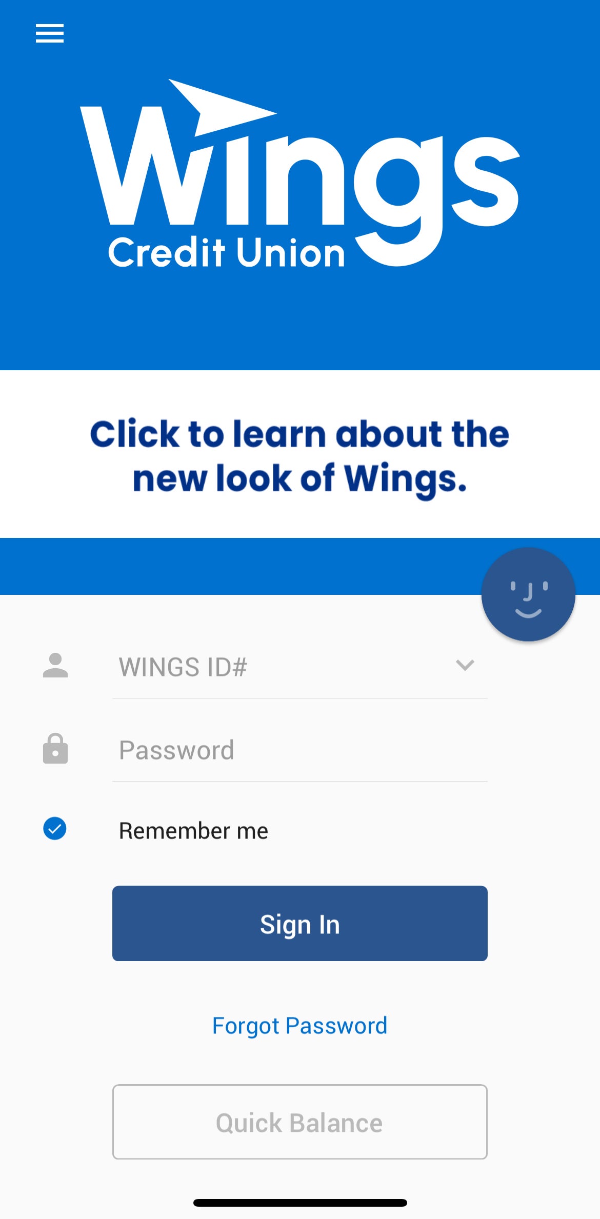
It would be safe to assume that the main reason a user would be engaging with a bank’s app is to check their bank account — so make it easy for them!
Developing your app or website for a tablet is another consideration to be made. Obviously, there is more screen space with tablets, so you have got more room to work with. Once you have the important features included (username and password), you have the flexibility to make it more visually appealing; add a header image and some more fleshed out menu options. With desktop, you have even more room to work with.
With our banking app as an example, you can see the natural progression of starting design small and working to larger formats.
Designing for Mobile First: Best Practices
The development process of your app is going to depend a lot on the level of complexity that comes with it. You will have to adjust goals and testing objectives accordingly, but below are a few best practices for a mobile-first design that you should be mindful of.
Intuitive Navigation
This is one of the — if not the most — important considerations to make for your app or website. With a mobile-first design, you have limited space to work with. The quickest way to frustrate a user is by making your app difficult for them to use. Use features like hamburger menus to access secondary site information.
Priority Content
Determine what you most want your user to do with your product and lead with it. Do not bombard them with content they will likely not want to engage with.
Testing Under Real Conditions
Testing your app on real devices under real-life conditions is one of the best ways to ensure your user experience is flawless. Perfecto’s real device cloud empowers testing teams with more than 10,000 devices for testing on mobile and tablets.
Ditch Excessive Pop-Ups
Nobody appreciates a lot of pop-ups on a desktop, so imagine that disdain compounded on a much smaller mobile device screen. If you do want to include a pop-up for a feature or limited-time offering, make sure to keep them to a minimum.
Related Reading: Why Enterprises Choose Perfecto
Bottom Line
The amount of web traffic coming from mobile devices is the dominant source in the market and it is only going to increase. Users are consistently moving away from a desktop experience in favor of their mobile devices — which is why it is important for developers to implement designing for mobile first into their process.
It will not only reduce the headaches and potential issues arising down the line, but it will also inevitably create a far less cluttered and more seamless user experience. By designing for mobile first, you will be able to stay ahead of the game and ensure your app is being used the way you want it to.
See how Perfecto works across mobile, web, and desktop testing, scriptless automation, AI-driven execution, and analytics in these guided demos.